Building development on site

Interior Design

From this…

To this…. (slightly a bombshell site so please excuse the mess!)

There was a bit of stall in the build over the winter due to weather and trades being booked up, but it is finally nearing completion (externally). The client has started to install a natural swimming lake in front of the building, which will overflow what is seen in this picture (this is the deep swimming channel area) and have hundreds of marginal plantings to the sides. Then the building will look as if it is floating on the water (below). A jetty is being added so you can exit the building and dive straight into the water.. fantastic!

Next up; interior fit out and jetty, plus I want to see the lake finished and established, and the trees to get their leaves back so we can see it in its full glory. It has been a long journey, mainly as it is R&D, but so worth the wait!

Design Life

architectural design, architecture, Interior Design, working

Some musings as I navigate the design world, suffer the post pandemic lack of wood (!) and continue my design adventures

I am already working on hospitality designs in the tourism sector, and designing holiday homes for Urban Blossom who are a luxury brand and deliver quite different buildings to the norm. This has been a long journey but very rewarding. I had free rein to design, and they are alll based on natural shapes. In terms of construction, they are very challenging and I am sure I have had people cursing me secretly when I deliver the designs for fabrication. But hey, what else is a structural engineer for!!! Given that I am not an architect but have trained as an Interior Designer, they have been a steep learning curve, and I have a wonderful technical team who can realise the designs practically.

One of my first designs I created for them is being built in the Lake District as I type, and is is surreal to see something initially doodled on paper turning into a real-life (and actually quite huge) building. This shape was based on a dried seed head I found, and from there it became an octagonal two storey building encased in an exo-skelton of curving struts.

‘The Bud’ Concept Design

The client wanted this external shape of The Bud, but with footprint of another Urban Blossom building I designed which is larger. So they will have an additional roof terrace area on the top. This structure is going to be placed adjacent to a huge natural swimming pool/lake, so you can exit the building onto a jetty and jump straight into the water. I am so excited to see it all when it ifs finally completed, but for now it is a building site.

Here are the construction crew at work as it starts.

It is mainly made from extruded structural recycled glass which is carbon positive, fireproof, lightweight and recyclable. This new materials had to go through structural testing and accreditation as a building material for use, so it is very exciting to be able to use it and is a forward-thinking material for future builds. All of that glass that people recycle religiously tends to actually end up in landfill, so this material takes it and repurposes it for a much better use.

In addition I am designing some lodges for a hospitality group to be sited in Yorkshire, construction starts this year. These adhere to Caravan Act parameters so they are modular, built offsite in sections, a set width and can be sat on a chassis (which you can hide in a pit or cover with surrounding decking). I wanted to get far away from the whole aesthetic of what people expect from a caravan. No plastic exterior/interiors, and using beautiful architectural materials such as seam wrapped aluminium and natural wood. These designs should change perceptions of holiday living and caravans. Here is a concept sketch.

More pictures to come on the build as it happens. Meanwhile I think those workers need some sunscreen delivered as it was boiling hot this week and they have no shade..

Final Major Project Underway

architectural design, architecture, Art, Interior Design, university

I am now in my third year at Uni, (time has flown by so fast, I cannot quite believe it), and I am now working on my FMP. The site I chose to design is the Arnolfini mixed use building in Bristol, and I am re-imagining it as a new Art Gallery, using all of the space and reconfiguring the internal floors and roof areas.

This has been a really intense project so far, the scale of the building is vast and there are so many elements to consider. I made a sort of shopping list to remind myself of what I need to do / add/ remove and it grows daily as I work through the project.

My inspiration for the design comes from several areas; the building is set on the edge of the floating harbour and I loved the reflections of it in the water. From these I have designed panels and balustrading to use in the site.

The stonework on the building is beautiful, they have what is called vermicular rustication on the stone and I love the way the light plays on it. Taking negative shadows from the stone I have cast light through them. These also influenced the balustrading patterns.

The building was built originally to store tea in the booming trade in the 1830’s and which was expected to be stored in Bristol, but by the time it was completed, the tea trade had moved to London. Known as Bush House, the site became an iron foundry and then a bonded warehouse. Research into this trade has given me lots of ideas, especially using the pattern of shipping lines used for the original intention of Bush House.

Tea Trade Route Lines

These lines will be manipulated into design ideas within the site.

I have had some great finds in my research, done a poll with local residents and had interviews with curator/gallery head experts like Sir Nicholas Serota, Sir Nicholas Penny & Patrick Elliot who have helped me realise what is needed in such a large gallery to make it successful. I will post more as I go…

Working on student designs in isolation

Decorating, Interior Design, Musings, university

The recent outbreak and isolation strategies have made it possible to work in my own studio in my home for the current University project.  I am designing a new site for the restaurant Box-E in Bristol, to include a light fitting design with a prototype model.   We wearer supposed to be having a big Crit this coming Tuesday, but now I think it will have to be virtual instead.  Although the latter part of the project is simply not possible without the fabrication facilities at my University, I have managed to get on with the rest of the work thanks to my trusty (but quite slow) Mac and subscriptions to programs like Autocad, Adobe, Sketchup and VRay.  The student rates for subscriptions make it just about affordable to use these programs, and if not there is always paper, a scale ruler and a pencil -a reversion to the old ways of designing before computers were invented.

The pro’s of this current situation are that I am not wasting 3 hours a day travelling to and from University.  It should only take 40 minutes as the bird flies, but I meet up with all commuter traffic usually, so spend a lot of time sat in jams.  This is not all negative as I have a clear ‘thinking’ time, which has got to be good for my mindfulness and wellbeing  – as long as I don’t get road rage…  Plus I get to listen to lots of music and podcasts thanks to Spotify and BBC Sounds, so I can arrive at my destination bursting with information and inspiration.  But I am also finding that being at home and not travelling this week makes these 3 hours really count as productive time.

Another pro is that I can set my computer to render whenever I want, especially overnight without worrying that I am hogging a machine from other students.  I also don’t have to pack a huge amount of bags every morning with all manner of equipment that I ‘might’ need, lug large portfolios or make a packed lunch.

The con’s are that I cannot use the amazing facilities at University at the moment, especially Fabrication where I can get messy and experiment with making things.  The technicians are really helpful and so full of skills, and as I have done a lot of the induction training on machines I can normally just get on with making samples, trying new things etc.  I also miss the  extensive library where there are a lot of magazines, periodicals and books on interiors and architecture to browse, the internet is great for information but it’s too easy to scroll and miss something compared to looking at a book in hand.

Also,  I have developed a bad habit of not really bothering to get dressed straight away now that I am stuck at home.  I have answered the door twice this week to delivery men, had a 2 meter chat with neighbours over the fence, and taken out the bins, all whilst clad in my dressing gown and at around 4pm.  Mental note: must try harder….

But in spite of all of the craziness of this week, I have still managed to build my final scale model, finish my autocad and sketchup designs, create visualisations and organise my samples.  My A1 boards are done and were ready to be printed tomorrow, (now to be electronic), and I also made a start on other Uni work such as my portfolio.

Considering that I am also working 2 days a week (also now from home), being a mum, feeding the family, doing the laundry, cleaning, gardening and running a house… I think I am doing OK!  Maybe I deserve the pyjamas and dressing gown scenario after all.


Dom-Ino House Project

architectural design, architecture, Interior Design, interiors, site survey


wide with antique background
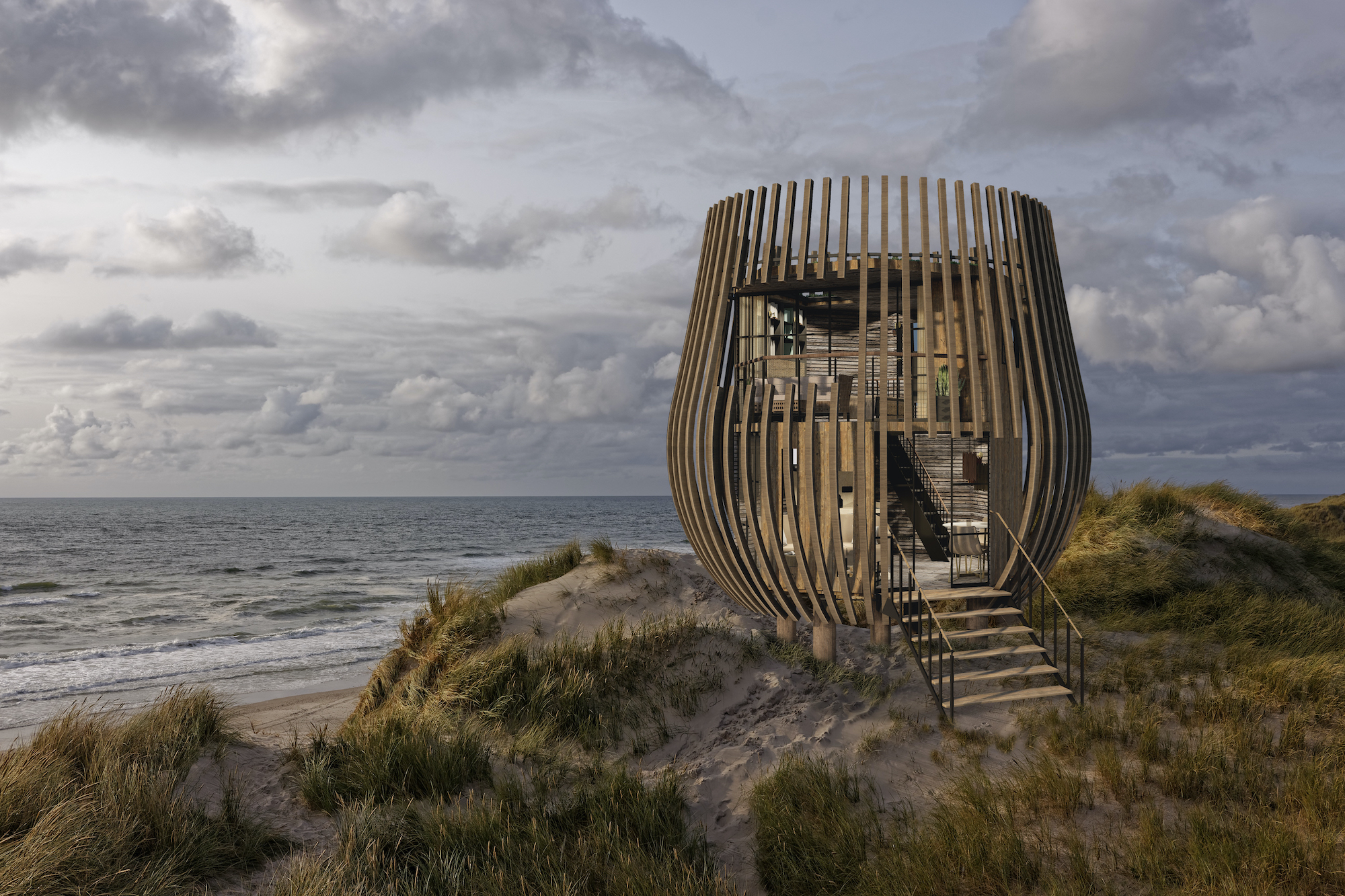
This brief was to design a second home for the installation artist Olafur Eliasson.  The site is situated at the top of a tranquil gully in the Avon Gorge with a steep drop off, and amazing views down to the River Avon.  Having lived in and around Bristol for many years, I had no idea that this secret place existed, and took the theme of secrecy as a key inspiration for the project.  The house architecturally is based on Le Corbusier’s Dom-Ino house structure – slab walls, pilotis columns and a staircase.  This allows for multiple choices as to where walls and windows can be placed.

final elevation 1 tinted vs 2

My client is known for his works with light, colour and creating new perceptions of views, so this was all considered in the design of the home.  I wanted to create a space for him that is a live/work studio, with distinctive private and public spaces.  Eliasson is half Icelandic, so this is referenced as well in the use of turf on the roof of the house – a nod to the ancient Icelandic buried hill houses.

Post Crit front house with shadows fade out white copy 2

The design embeds the house into the cliff, so that from the northern approach you do not even know there is a house there.  It is only when you are standing on top of the roof that you realise there is a staircase descending into the house.  There is a 1m meter space around the house within the carved out space in the cliff,  so it lets light fall from pierced walkways above and feed natural light into the house.

house sunk in hill 1 smaller file

My client is passionate about ecology and sustainability, so external building materials used in the house include rammed earth walls, hempcrete, recycled glass and turf.  Then structure is concrete, but uses the most ecologically available mixture made from 70% recycled slag furnace waste.

The entrance into the house is by moving down the stairwell, these have a pierced wall system designed to create spots of light in the sunshine which move across the space as the sun moves overhead.  Mirrored stainless steel walls create strong reflections and further bounce light through the stairwell.

STAIRS and woman

The studio space is on the first floor and is open plan, with a kitchen area concealed behind sliding doors.  A ceiling grid allows for maquettes to be hung up out of the way.  The furniture is all on castors so the room can be reconfigured as an office / studio / dining room /exhibition space.  An oculus window was designed to distort the view looking in and out into the gully.  Along the mainly glazed south facing wall are a system of internal glass sliding panels in colours which can be moved to create new perspectives and views of the valley beyond.

Studio Visualisation

oculus lite

The floor below is a personal space for my client where he can relax and sleep.  A large balcony creates an exterior entertaining space with a system of textural glass screens.  The interior is a neutral and calm space with natural textures.  A fireplace pierces the wall so it can be accessed both inside and outside.

SITTING ROOM BEST SMALLER copybedroom BEST copy SMALLER

The final level is a secret place that only my client can access. An internal jib door is concealed behind a bookcase, and opens to reveal stairs leading to a sub level.  This is open air, but protected from wind and rain by the house above it.  Pilotis were raised to 2m to create this space.  Here my client has an outdoor kitchen, decks, a dance floor (he was the Swedish champion in breakdancing for 2 years running!), and a luxurious wood fired Swedish hot tub so he can use it all year round and enjoy the views.

house front very paled out copy low res

Finished Model-ALL PLANS

This project entailed the learning of CAD for the first time, and material testing with fabrication of glass, concrete, hempcrete and rammed earth samples.


How a pot of paint can cause chaos…

before and after, Colour, Decorating, Interior Design, interiors, Makeover

In the last couple of weeks I decided to repaint my sitting room.  It has been the same colour for ages, and I felt an update was in order.  I am getting very drawn to orange at the moment, and as the room has a lot of light and high ceilings, I felt that it could take a dark tone and create a different feel to the existing colour.  This is the room as it was…

It was originally painted in Drab, a now discontinued Farrow & Ball paint.  I chose a strong orange by Valspar called Storybook Sundown to replace it.  I have orange elsewhere in the room in the rug, upholstery and cushions and this colour complimented them the best…

ab0698dc-ffec-4472-9a0a-2b438379b302.jpg

So with 5 litres I started to paint.  You  know that moment when you think ‘Hmm, not sure if I am liking this…?”, well it came pretty soon after the first coat.  I have been so used to the previous colour and this is so out of my comfort zone that I started to to think I had made a mistake.  But I decided to continue to see what would happen.

X9GmouHOQce56%D+ZJweSw

BUT… once it was done I loved it.  Really vibrant, rich and cocooning.

Now this is where the chaos started… when I say chaos I mean a nuclear chain of events starting from the initial one pot of paint.   My sofa now looked really insipid against all of the other bright colours.  The room needed something stronger/darker in colour/tone to work with these walls.  The current sofa is a Wesley Barrell Knole, and cost a huge amount when purchased.  It is quite tired now and has been an old faithful for over a decade, so I thought this would be the time to revamp it.  Investigations into re-upholstering it revealed it costs as much if not more to do as getting a new sofa.  The seat cushions alone cost £500 for new inserts, not to mention 15m of fabric and upholstery costs.

Egged on by my daughter we set out to find a new sofa.  On my wish list the main priority was NEVER HAVING TO EVER PLUMP ANOTHER CUSHION AGAIN.  This has been the bane of my life with sofas, and actually if I add the hours spent doing it I could have learnt a new language or trekked across a country instead.  So number one priority was a sprung seat and back sofa.

Research then ensued; size, shape, fabric, finish, durability… The internet is great for hunting, but I want to see them in the flesh too and sit on them to see if they are comfortable.  A bit like Goldilocks and her chairs – too firm, too soft or just right?  A sofa is a big expense as well, so once a shortlist had been made we set off in the car on a sofa bouncing mission.

Stop one was a high street store that had not been on my wish list, but was on the way to another shop.  As we mooched about I spotted the perfect sofa; sprung, buttoned and available in the fabric I wanted. It was in DFS, is called the Trafalgar and is a modern version of the chesterfield with buttoned seat and back, plus proper springing.  The shape is more angular than the traditional rounded chesterfield but that is why it looks so nice.

m7UZdVqxSsWR+vI4TBezvA

The detailing is lovely, with upholstery studs along the front:

u9mOTkgRQEaQIb+6FtCKRw

But this colour is too pale and I wanted a richer more textural fabric.  And voila, in their books I found:

160Xr9AySo2aLs+Gh9tLMg

The perfect velvet; not shiny like a lot of modern versions but lustrous and deepest black.  And so reader, I ordered one.. and it comes in about 6 weeks to reface the old faithful Knole sofa (which incidentally is going to a very good home where it will be loved  for many more years).

So that was Chaos Element No 1.  This pot of paint has now cost me a new sofa.. but it doesn’t end there.  I like the idea of adding in more black to define the room, so black lampshades have now been ordered for the lamps around the room in black, and passementerie trimmings have been ordered to jazz them up.  That’s Chaos Element No 2.

On top of that I have now started hunting for new curtains to add more drama and tie up the room visually as the current ones are lovely, but look quite pale now compared to the other colours going on in the room, and that’s a 10ft tall bay window to negotiate as a starter.  Not something you can use readymades on easily… so let’s call that Chaos Element No 3.  I’m thinking watered black silk puddling on the floor would be a bit special…

With that I will sign off, as I need to plan how to create these curtains on a budget, but so they don’t look it.  All this from just one pot of paint…


Clerkenwell Design Week

Decorating, Exhibitions, Experiences, Interior Design, interiors, lighting, Soft furnishings

This past week has been the industry hotbed that is Clerkenwell Design Week.  I spent a day perusing the offerings, and some of these products caught my eye:

LIGHTING:

The lighting show was held in Fabric nightclub, which meant that they could be displayed brilliantly.  There were a lot of ‘repeat’ concrete shades around, but a few designs stood out:


This beautiful light by Lomas Furniture has a shade of pierced ceramic and looks like the moon…

More lighting which caught my eye came from Pad Home.  This was totally organic in shape, made from cardboard and reminded me of large wasps nests (in a beautiful way)…

IMG_3401

CERAMICS:

I found some gorgeous surface textures at Solus, some were slate with what looked like lasered patterns on them:


They also had gorgeous 3D hexagonal tiles, and can supply simple ones in a huge range of colours.

A95A11FD-7E97-44E0-8632-1F6471032E26IMG_3382

BATHROOMS:

The highlight of my visit was finding this sink, however the price tag is eye watering .. it is the Brockway by KOHLER.

sb3618-3600

It comes as 1/2 or 3 tap sizes, and reminds me of a cattle trough.  Prices in the UK where I can find it are £2K plus, so maybe not for now… I am devastated!  Maybe I can convert a real cattle trough instead?


IMG_3385

I also saw this beautiful building in Clerkenwell, it looks like Fred Flintstone built it with rough hewn stone frontage in areas.  Absolutely smitten!

Design Trip – Denmark

Art, furniture, Ideas, Inspiration, Interior Design, travel

I recently returned from a design trip to Copenhagen, where the Interior Design department visited many museums, galleries and buildings to develop our practice.  What I noticed on the trip was how I have started to question design in relation to my visual cultural studies since starting the academic year.

In relation to areas in which my practice is specifically connected, I found that there is a real hierarchy of design ‘owners’, in that a small number of people have classed items as being of importance, and to that end the rest must follow suit in agreeing and accepting those definitions.  In terms of design history that makes absolute sense, eg: The Bauhaus changed ornamentation into form follows function and delineated all items, and given the age in which it happened it connects to social and economic change.   I do love modern architecture, especially Brutalism and post modernist hard lines, as it visually inspires me, but every item has a subjective reaction.

A Year of Learning…

Interior Design, interiors, Musings, Ramblings, university

So being a busy-bee student has definitely been a real adventure this academic year… but what a blast and I love every minute of it.

Next week I get my final crit from Tutors for my latest project.  I have been charged to design a Pavilion (full on Architecture style, from fixings to weights to construction), a bar to go in it, and do it all within a Grade I* listed site so absolutely no touching of the fabric of the building etc.  I am finding that I have a bit of Brutalist slant to my work, which is very surprising given the chaotic clutter which I live in (and love)…

I realised I have not posted any work on here since I started back at Uni, so here’s a few bits and bobs I have done this year to prove why I have had no social life, sleep or spare time to post much… 🙂

Semester 1:  Theatre Design & Product Design

Here I started out learning about Orthographics and site surveys.  Basically if you do this type of drawing by hand, JUST as you reach the end of a drawing your hand slips and you have to either scalpel off the ink, or more usually START AGAIN…Gah!  My tutor also is an architect, and knows if I am on a 0.01 or 0.1 pen so you can’t make any mistakes as he’ll know.

PORTFOLIO MASTER COPY 4 UPLOAD copy7

I started to learn how to make scale models.  This is something I love doing, and think I am like Gulliver but maybe with more fumbly fingers and a tendency to superglue myself to small things…PORTFOLIO MASTER COPY 4 UPLOAD copy8

My next challenge was to design a theatre installation inside a beautiful Medieval Hall showing an excerpt of a scene from Macbeth.  This is where the brutalist streak started coming through I think… why try and complete with 600 year old carvings, go the opposite way….!  I also made films as part of the design as that is something I used to do in the past for a living, and this design had no budget attached so I went all out for it…

PORTFOLIO MASTER COPY 4 UPLOAD copy11PORTFOLIO MASTER COPY 4 UPLOAD copy12PORTFOLIO MASTER COPY 4 UPLOAD copy13PORTFOLIO MASTER COPY 4 UPLOAD copy14

The next project was to design a piece of modular furniture to be used in a travelling exhibition planned for the first ‘Martian House’.  This will be a pod designed a bit like the Antarctic science stations for prolonged living on the red plant in 2030.  I was asked to focus on wellbeing and health, so came up with a multipurpose item that becomes  amongst other things gym parts with added games to spice up what will be probably be a very dull life on Mars…

PORTFOLIO MASTER COPY 4 UPLOAD copy16PORTFOLIO MASTER COPY 4 UPLOAD copy17PORTFOLIO MASTER COPY 4 UPLOAD copy18PORTFOLIO MASTER COPY 4 UPLOAD copy19

Semester 2/3:  Staircase / Pavilion & Bar Design

I had to present a project on the design of a staircase by a notable architect, (right down to delivering a correctly scaled model).  I was given one by the architect Santiago Calatrava, one with NO KNOWN MEASUREMENTS ANYWHERE, which resulted in me travelling to Basel in Switzerland tape measure in hand.  But I measured the thing and managed to build the model to scale.

Capture One Session0076Capture One Session0047

Below is my last project this year, and I will know if I have been slayed by the end of June (gulp)….  I have worked myself to the bone in this one, and cannot even begin to count the hours/days/weeks/months it has taken…

blog

blog2

What have I learnt?

Less is More and document everything!  I have to justify and be accountable for every minute detail, right down to fixings and screws.  I have also had to learn a huge amount of new digital skills as presentation boards are so vital; Photoshop, Rhino, Sketchup, Illustrator, Lightworks, CAD and so on.  My iCloud storage is huge already as a result and I have over 11,000 photos on my phone….

I have also learnt brilliant practical skills; steam bending, digital fabric printing, woodwork, welding, plasma metal cutting, textiles, ceramics, 3D printing, laser cutting, fabric manipulation, resin and jesmonite techniques, and more.  I have learnt the (new) ways of digital studio shooting in photography, (I am so vintage that I did my first degree in photography on film, and digital did not even exist!).  The fabrication facilities are amazing at my University and the technical staff are brilliant, I am making them a huge cake next week to thank them for teaching me so much already.

On top of all of the practical I also had to deliver a critical blog and essays.   Now I know why Uni students have/need such long summer holidays, I am frazzled but still raring to go for September this year although I think the pressure will be on even more….

Adios for now

Emma

Object of Desire – Bespoke Wallpaper

Decorating, Interior Design, interiors, wallpaper

This week’s obsession is not the Royal Wedding for me, but the amazing new wallpapers which I keep seeing everywhere as new designers embrace the digital printing possibilities that are now available.  It seems that interior trends are embracing large scale and bright patterns, and while they may not be for everyone’s taste I love the boldness they offer.

The original bespoke wallpaper in Europe from makers such as de Gournay are exquisite and I have always lusted after a bespoke wall covering.  But they are not cheap, and there’s a part of me that just cannot justify the expense.  But just look at the beauty of them:

IMG_9379IMG_9380

Recently, due to my somewhat obsessive scouring of Instagram and Pinterest, I came across a designer team in New Zealand called Back To The Wall.  These designers do huge digitally printed murals in gorgeous designs, and while they may not have the hand finished painterly effect of a de Gournay, they are still pretty spectacular.

IMG_9386

In the UK, another digital mural company well worth looking at is Surface View.  They have a huge collection of images available to be printed up as large scale murals.  Their botanical and historical prints are pretty amazing and you can go as wild or as tame as you like in terms of design.  But all are large scale for a great feature wall.

VAA0152

Surface-View-Wall-Mural-Floral-

Another favourite who I love is House of Hackney.  They print beautiful designs which are quite intense, sometimes quirky and also designed as a set of 3 panels which can  repeat around a room if desired.

House-of-Hackney-9

I used their design Florida Onyx in my renovation of a townhouse as panels on wardrobes and it was stunning.  Who knows, one day I may be brave enough to do a whole room?!

IMG_5883florika_wallpaper_onyx